Are you actually measuring data quality?
We know the map is not the territory, yet when it comes to data quality, we tend to obsess over the equivalent of the paper our maps are printed on, rather than fulfillment of their purpose.
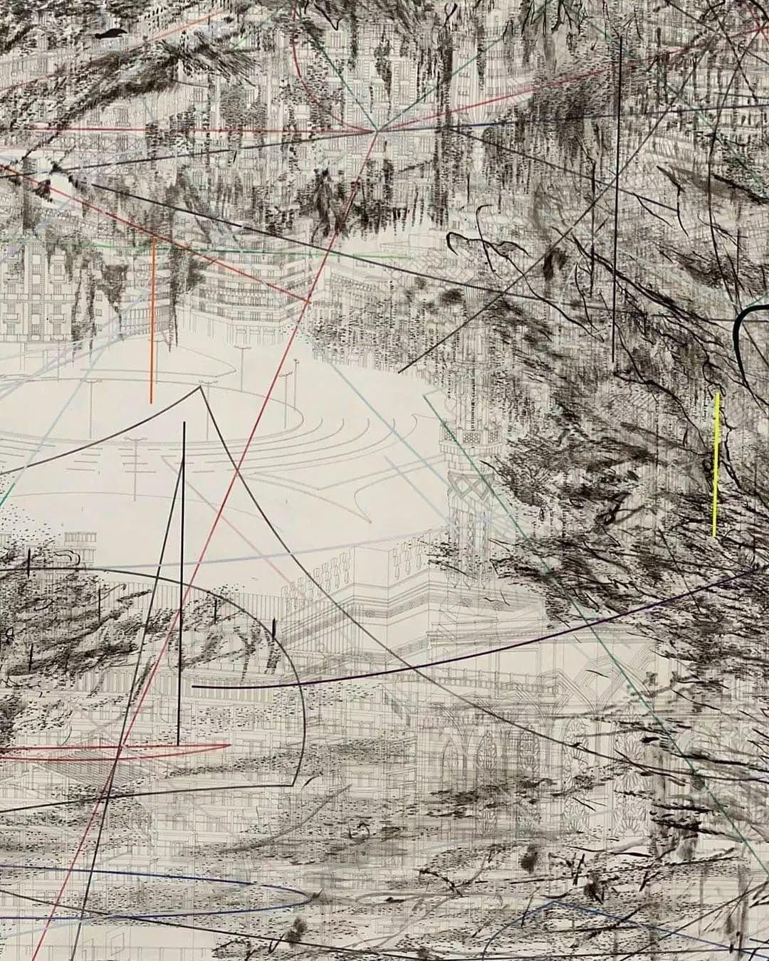
Data is a woven net thrown over the world, capturing it in a grid of variable resolution. We want to capture as much detail as we possibly can, but it's then crucial to make judicious decisions about how we translate what we capture into a useful map. Typically though, when it comes to quality, we proceed to measure things like the internal consistency of multiple printings of our map, the resolution of the ink, and how quickly we print new maps in response to changes in the terrain. Two related maps stay internally consistent? Quality. Granular resolution of detail? High quality. Map updates in near-realtime? The highest quality. We often assume that making these kinds of measures higher in our output is an unalloyed good.
There's a problem with these self-referential, almost tautological measures though: none of them tells us if a map is fulfilling its purpose.
Maps should be measured on how well they get you where you want to go. To do that maps need to be as detailed and accurate as necessary and no more.
A trip to the library
Imagine you need to drive from your home to the library. You pull up a map that not only shows roads, but every plant, person, animal, and vehicle in realtime. These constantly shifting features would actively obscure your ability to plan your route. You just need to see the roads, and ideally some reasonably aggregated traffic information.
This example illuminates an important truth: to know the proper level of detail, pace, and presence for our maps, we need to know where we want to go.
This is intentionality, the missing ingredient I most often see lacking in my work as an analytics engineer.
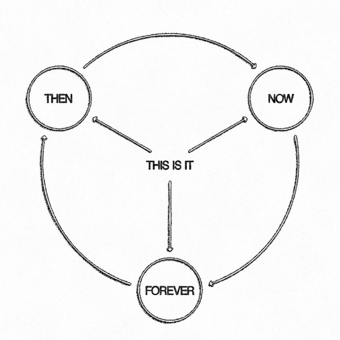
Usually, this is because intentions around the maps themselves obfuscate that this larger, more necessary intention is missing. For example, we may think "I want to understand my orders and revenue" is our intention. This is directed at the map though! We need to know the purpose of the map. "I want to increase revenue by 10% over the next year" -- that's an intention that can inform our map-making.
Knowing that is like knowing we want to take our car to the library. It informs a host of decisions we need to make: what resolution is ideal, how often our map needs to be refreshed, what features are important to include, and more. These are necessary foundations for real assessment.
Intention is the canvas for impact
Defining these foundational parameters of our map will save us needless time and expense, but most importantly, they allow us to actually measure the quality of our map.
There's nothing wrong with current conventional data quality measures, they are in fact highly useful. They should be secondary though to actually measuring the impact and effectiveness of our data, and to do that we need intention. There is constant discussion of how hard it is to measure the impact of data teams, and that's directly because of a lack of intentionality with our data. The more we can stake out our desired destinations when building our maps, the better we can measure how well they got us where we wanted to go.
The next time you're getting ready to build a model, create a dashboard, or ingest a new data source, make sure you know what your intention is. Where do you want to go and how fast? What metrics do you want to move, by how much, and by when? How can you bake measuring these intentions over time into the process of building with data?
Start bringing intentionality into your work, and watch your ability to measure your impact, partner with stakeholders, and prioritize your days flourish.


